可视化 - 柱状图:matplotlib vs. ggplot2
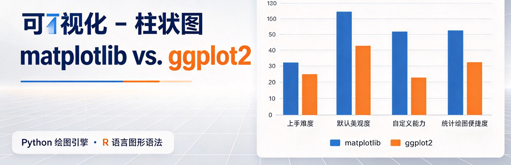
本文为可视化系列第 02 篇,将介绍柱状图的基础概念、适用场景与数据集选取,并分别使用 Python Matplotlib 和 R ggplot2 两套工具,演示绘制同一幅柱状图。

柱状图

柱状图,也叫条形图,是最常用的数据可视化图表之一,用矩形柱子的高度(垂直柱状图)或长度(水平柱状图)代表数值大小,用来对比不同类别数据。

适用场景:

  • 不同类别数据大小对比 -> 单系列柱状图
  • 同一维度下多组数据并列对比 -> 分组柱状图
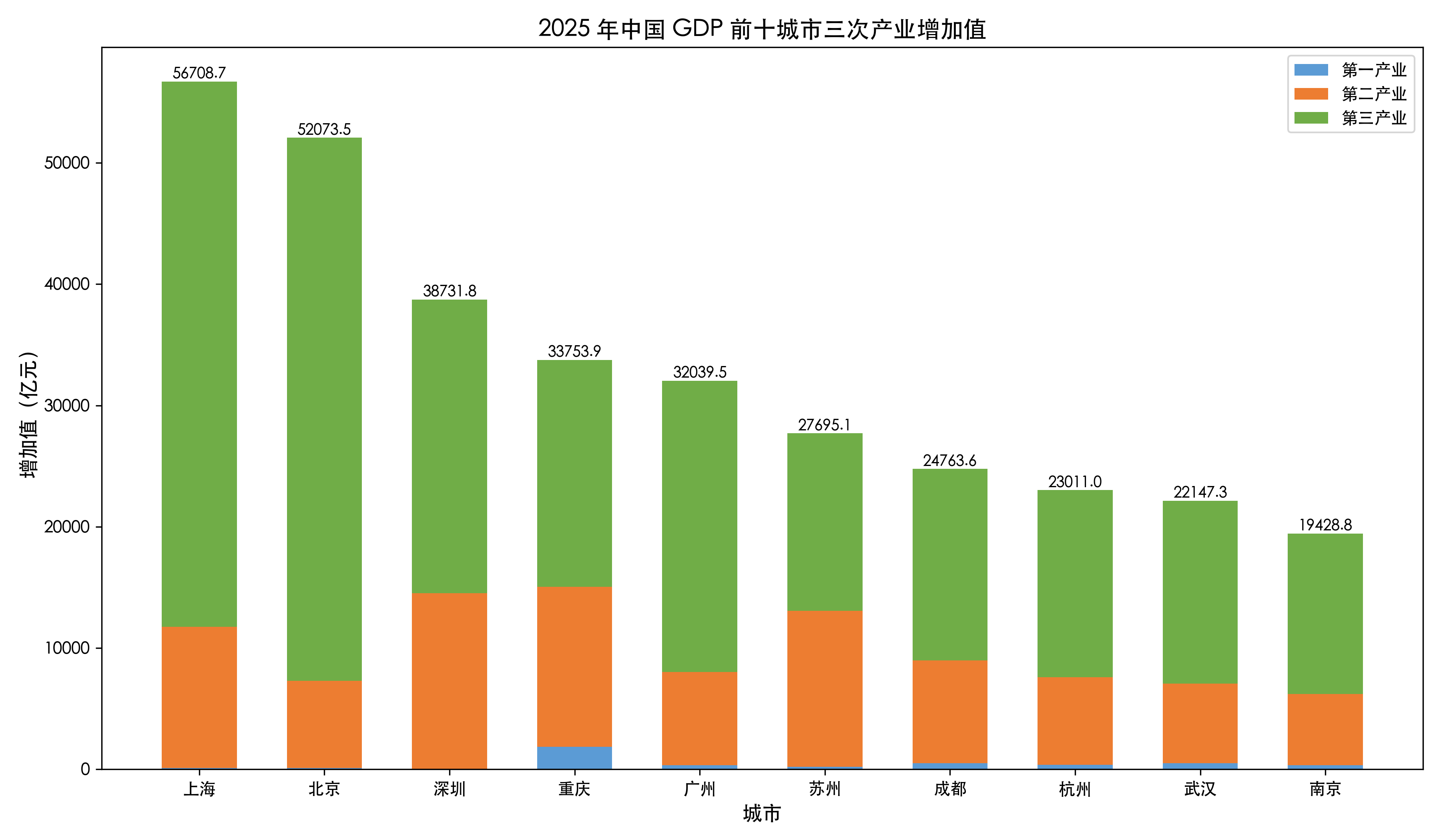
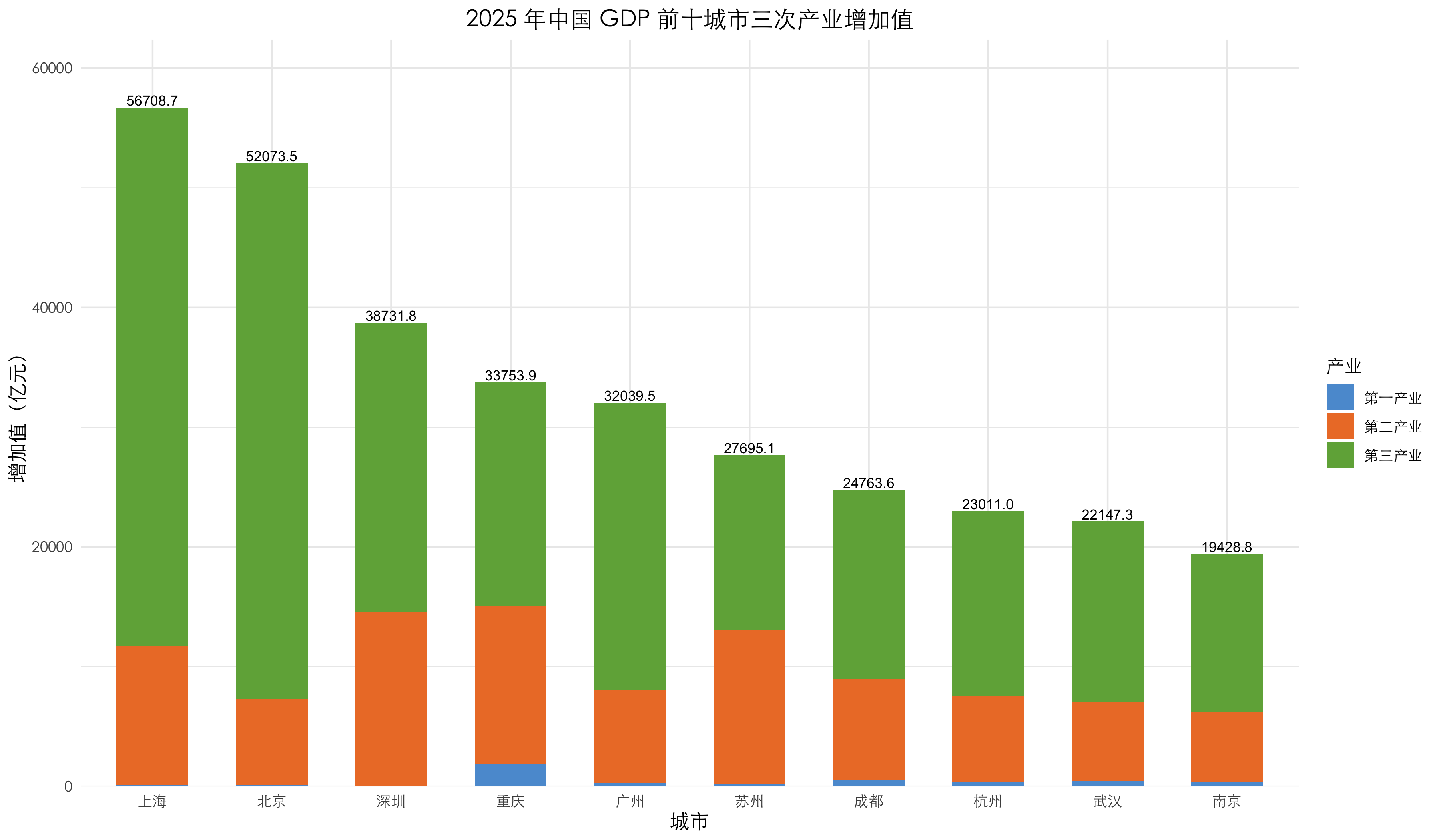
  • 看总量及内部组成占比 -> 堆叠柱状图

单系列柱状图

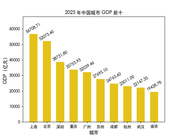
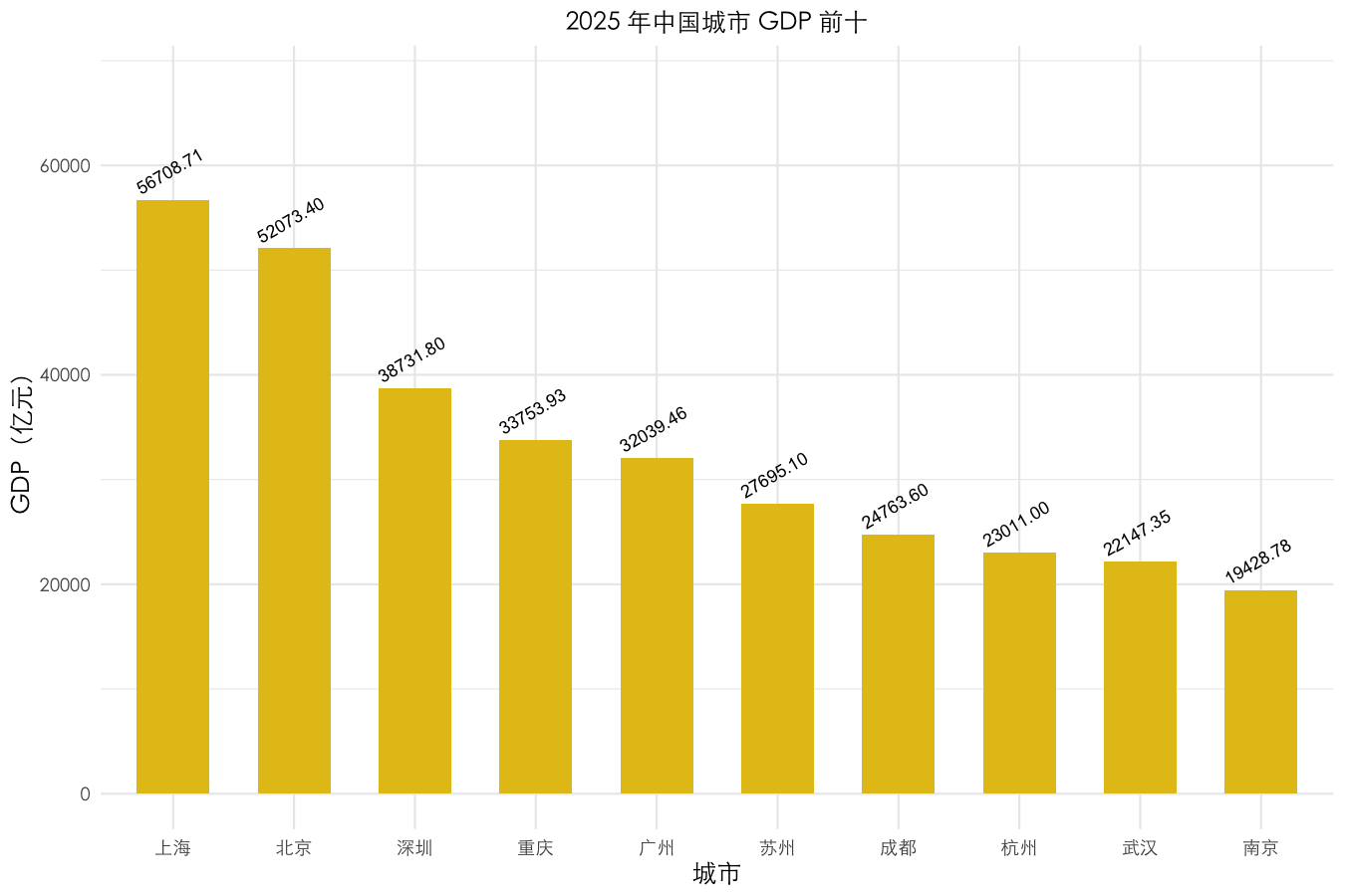
单系列柱状图是柱状图最基础的形式,只包含一组数据,它借助柱子的高度来对比多个独立类别对应的数值,能够直观展现同一个指标在不同分类下的大小差异。

Python Matplotlib

 1
 2
 3
 4
 5
 6
 7
 8
 9
10
11
12
13
14
15
16
17
18
19
20
21
22
23
24
25
26
27
28
29
30
31
import matplotlib.pyplot as plt
import pandas as pd

plt.rcParams["font.sans-serif"] = ["Heiti TC", "SimHei"]
plt.rcParams["axes.unicode_minus"] = False

df = pd.DataFrame({
    "city": ["上海", "北京", "深圳", "重庆", "广州", "苏州", "成都", "杭州", "武汉", "南京"],
    "gdp": [56708.71, 52073.40, 38731.80, 33753.93, 32039.46, 27695.10, 24763.60, 23011.00, 22147.35, 19428.78]
})

bars = plt.bar(df["city"], df["gdp"], width=0.6, color="#E4C21A")

for bar in bars:
    height = bar.get_height()
    plt.text(
        bar.get_x() + bar.get_width() / 2,
        height,
        f"{height:.2f}",
        rotation=30,
        ha="center",
        va="bottom",
        fontsize=10
    )

plt.title("2025 年中国城市 GDP 前十", fontsize=12)
plt.xlabel("城市", fontsize=12)
plt.ylabel("GDP(亿元)", fontsize=12)
plt.ylim(0, df["gdp"].max() * 1.2)

plt.savefig("city_gdp_by_matplotlib.png")
  • plt.bar() 方法绘制柱状图,width 参数设置柱子宽度,color 参数设置柱子颜色;
  • plt.text() 方法在柱子上添加数值标签:
    • rotation 参数设置标签旋转角度;
    • ha 参数设置标签水平对齐方式;
    • va 参数设置标签垂直对齐方式;
    • fontsize 参数设置标签字体大小;
  • plt.ylim() 方法设置 y 轴范围,确保所有数值都能被显示出来。

R ggplot2

 1
 2
 3
 4
 5
 6
 7
 8
 9
10
11
12
13
14
15
16
17
18
19
20
21
22
23
24
25
26
27
28
29
30
31
32
33
library(ggplot2)

font_family <- "Heiti TC"

df <- data.frame(
  city = c("上海", "北京", "深圳", "重庆", "广州", "苏州", "成都", "杭州", "武汉", "南京"),
  gdp  = c(56708.71, 52073.40, 38731.80, 33753.93, 32039.46,
           27695.10, 24763.60, 23011.00, 22147.35, 19428.78)
)

p <- ggplot(df, aes(x = reorder(city, -gdp), y = gdp)) +
  geom_col(fill = "#E4C21A", width = 0.6) +
  geom_text(
    aes(label = sprintf("%.2f", gdp)),
    angle = 30, hjust = 0.5, vjust = 0, size = 3,
    nudge_y = max(df$gdp) * 0.04
  ) +
  scale_y_continuous(
    name = "GDP(亿元)",
    limits = c(0, max(df$gdp) * 1.2)
  ) +
  labs(
    title = "2025 年中国城市 GDP 前十",
    x = "城市"
  ) +
  theme_minimal() +
  theme(
    text = element_text(family = font_family),
    plot.title = element_text(size = 12, hjust = 0.5),
    axis.title = element_text(size = 12)
  )

ggsave("city_gdp_by_r.png", p, width = 9, height = 6, dpi = 150)

  • reorder() 方法将类别按数值大小排序,确保柱子按数值大小排序,-gdp 表示按 GDP 从大到小排序;
  • geom_text() 的 nudge_y 参数设置标签垂直偏移量,确保标签与柱子不重叠;

分组柱状图

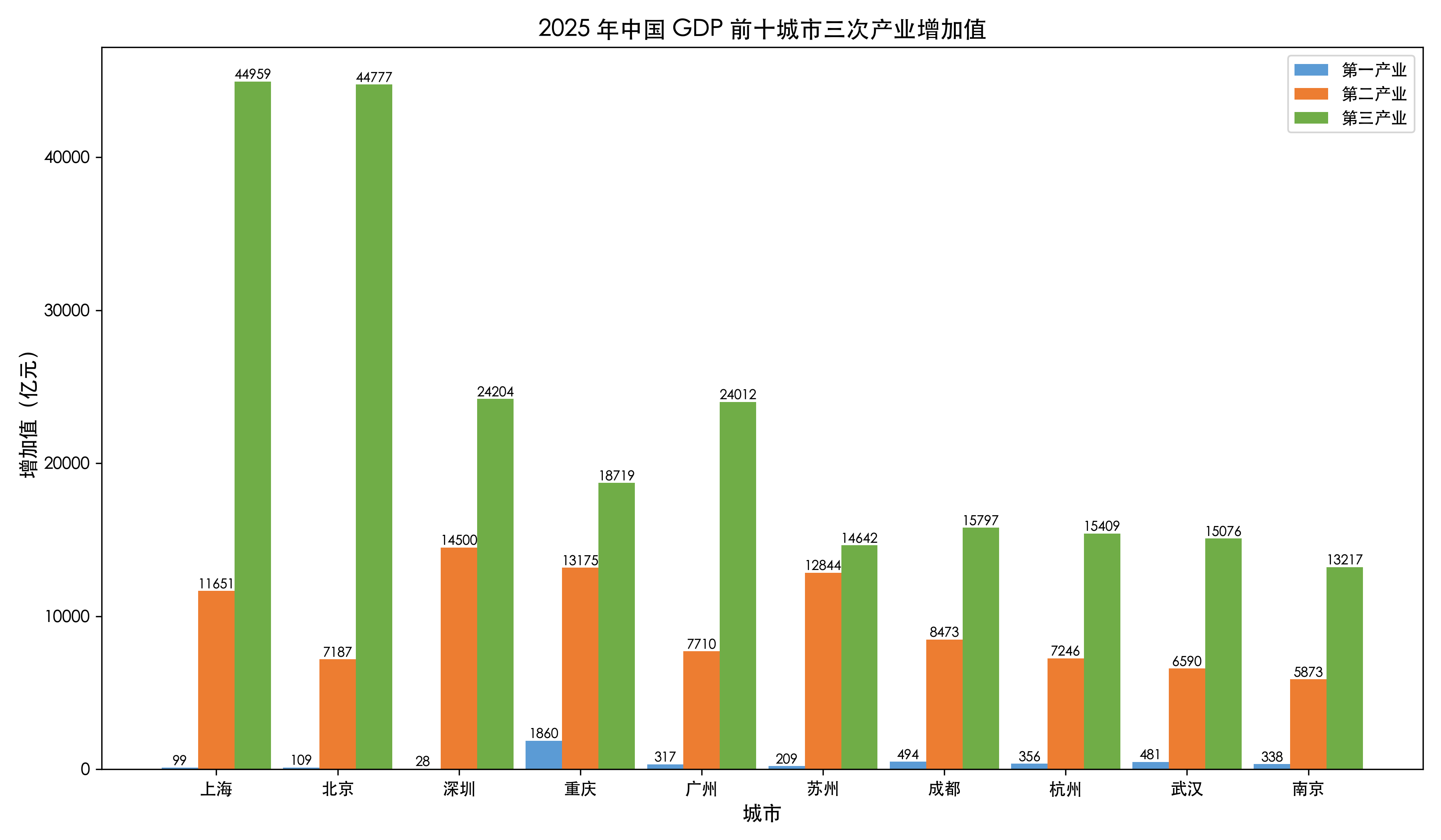
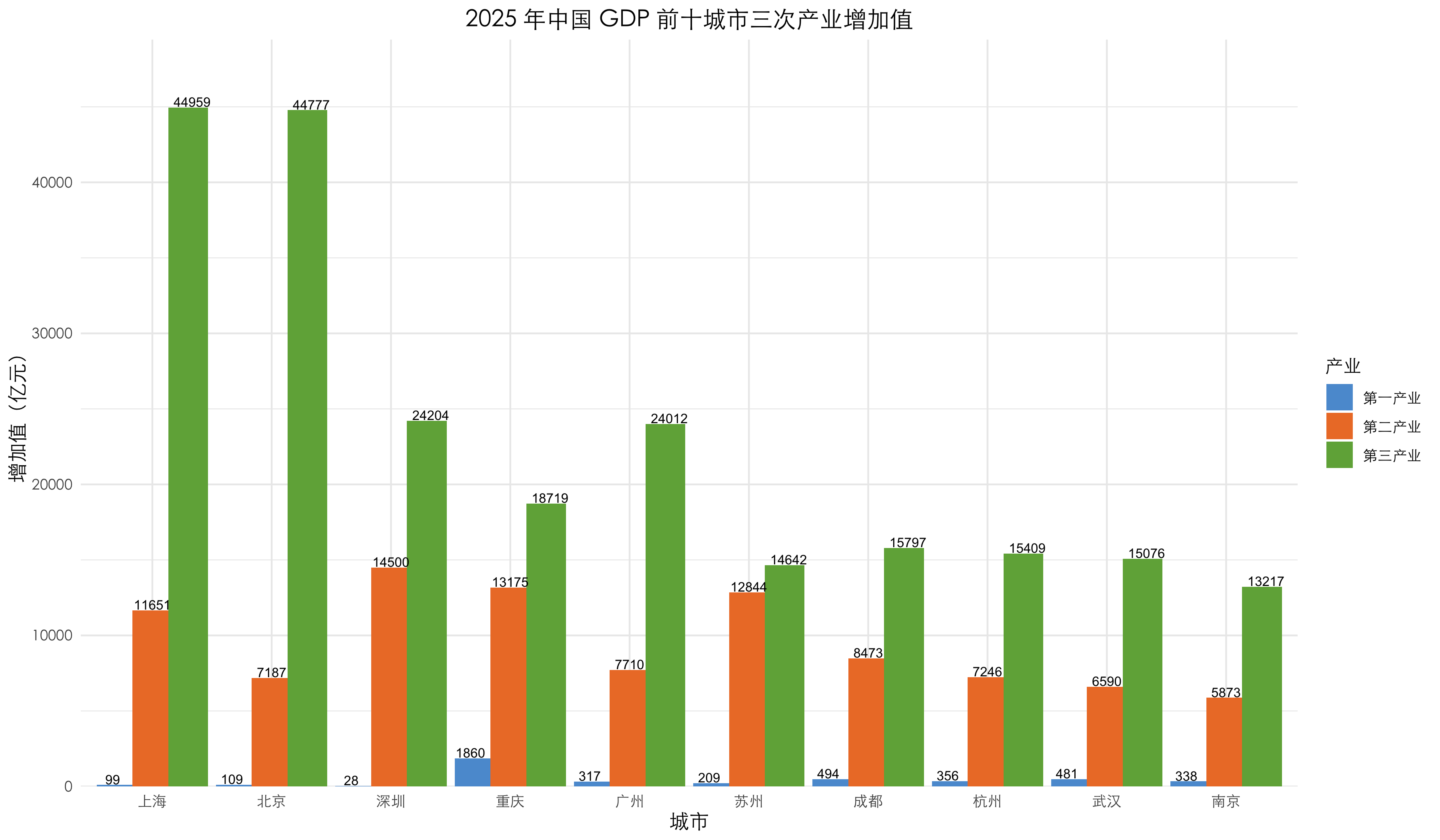
分组柱状图属于柱状图的一种,在同一个分类下并列放置多根柱子。它可以同时对比两组及以上系列的数据,直观展现不同组别之间的差异。该图表适合分析同一类别下多个指标的横向对比关系。

Python Matplotlib

 1
 2
 3
 4
 5
 6
 7
 8
 9
10
11
12
13
14
15
16
17
18
19
20
21
22
23
24
25
26
27
28
29
30
31
32
33
34
35
36
37
38
39
import matplotlib.pyplot as plt
import pandas as pd
import numpy as np

plt.rcParams["font.sans-serif"] = ["Heiti TC", "SimHei"]
plt.rcParams["axes.unicode_minus"] = False

df = pd.DataFrame({
    "city": ["上海", "北京", "深圳", "重庆", "广州", "苏州", "成都", "杭州", "武汉", "南京"],
    "primary": [99.39, 109.20, 28.04, 1860.12, 317.02, 208.90, 493.70, 356.00, 481.21, 338.50],
    "secondary": [11650.62, 7187.40, 14500.00, 13174.83, 7710.27, 12844.40, 8472.70, 7246.00, 6589.72, 5873.07],
    "tertiary": [44958.70, 44776.90, 24203.76, 18718.98, 24012.17, 14641.80, 15797.20, 15409.00, 15076.42, 13217.21]
})

width = 0.3
x = np.arange(len(df))

plt.figure(figsize=(12,7))

bar1 = plt.bar(x - width, df["primary"], width, label="第一产业", color="#5B9BD5")
bar2 = plt.bar(x, df["secondary"], width, label="第二产业", color="#ED7D31")
bar3 = plt.bar(x + width, df["tertiary"], width, label="第三产业", color="#70AD47")

def add_label(bars):
    for bar in bars:
        h = bar.get_height()
        plt.text(bar.get_x() + bar.get_width()/2, h, f"{h:.0f}", ha="center", va="bottom", fontsize=8)

add_label(bar1)
add_label(bar2)
add_label(bar3)

plt.title("2025 年中国 GDP 前十城市三次产业增加值", fontsize=14)
plt.xlabel("城市", fontsize=12)
plt.ylabel("增加值(亿元)", fontsize=12)
plt.xticks(x, df["city"])
plt.legend()
plt.tight_layout()
plt.savefig("city_3industry_group_gdp_by_matplotlib.png", dpi=300)
  • plt.bar() 方法绘制柱状图,第 1 个参数用于设置分组内柱子的位置;
  • plt.text() 方法绘制柱子上的数值文本;

R ggplot2

 1
 2
 3
 4
 5
 6
 7
 8
 9
10
11
12
13
14
15
16
17
18
19
20
21
22
23
24
25
26
27
28
29
30
31
32
33
34
35
36
37
38
39
40
41
42
43
44
45
46
47
48
49
library(ggplot2)

font_family <- "Heiti TC"

df <- data.frame(
  city      = c("上海", "北京", "深圳", "重庆", "广州", "苏州", "成都", "杭州", "武汉", "南京"),
  primary   = c(99.39, 109.20, 28.04, 1860.12, 317.02, 208.90, 493.70, 356.00, 481.21, 338.50),
  secondary = c(11650.62, 7187.40, 14500.00, 13174.83, 7710.27, 12844.40, 8472.70, 7246.00, 6589.72, 5873.07),
  tertiary  = c(44958.70, 44776.90, 24203.76, 18718.98, 24012.17, 14641.80, 15797.20, 15409.00, 15076.42, 13217.21)
)

df_long <- data.frame(
  city     = rep(df$city, 3),
  industry = rep(c("第一产业", "第二产业", "第三产业"), each = nrow(df)),
  value    = c(df$primary, df$secondary, df$tertiary)
)
df_long$industry <- factor(df_long$industry, levels = c("第一产业", "第二产业", "第三产业"))

totals <- data.frame(
  city  = df$city,
  total = df$primary + df$secondary + df$tertiary
)
ord <- order(totals$total, decreasing = TRUE)
df_long$city <- factor(df_long$city, levels = totals$city[ord])

p <- ggplot(df_long, aes(x = city, y = value, fill = industry)) +
  geom_col(width = 1, position = position_dodge(0.9)) +
  geom_text(
    aes(label = sprintf("%.0f", value)),
    position = position_dodge(1), vjust = -0.1, hjust = 0.5, size = 2.8
  ) +
  scale_fill_manual(
    name = "产业",
    values = c("第一产业" = "#5B9BD5", "第二产业" = "#ED7D31", "第三产业" = "#70AD47")
  ) +
  scale_y_continuous(expand = expansion(mult = c(0, 0.1))) +
  labs(
    title = "2025 年中国 GDP 前十城市三次产业增加值",
    x = "城市",
    y = "增加值(亿元)"
  ) +
  theme_minimal() +
  theme(
    text = element_text(family = font_family),
    plot.title = element_text(size = 14, hjust = 0.5),
    axis.title = element_text(size = 12)
  )

ggsave("city_3industry_group_gdp_by_r.png", p, width = 12, height = 7, dpi = 300)
  • df_long <- data.frame(...) 每个城市重复 3 行;industry 设为因子并固定层级,决定堆叠/图例顺序;
  • totals <- data.frame(...) 各城市总增加值,用于柱顶标签;
  • ord <- order(totals$total, decreasing = TRUE) 按总增加值降序重排 city 因子层级,使 x 轴从左到右由大到小;
  • geom_col(...) 中的 position = position_dodge(0.9) 使柱子并列且彼此贴合。

堆叠柱状图

堆叠柱状图是柱状图的一种,它将同一分类下不同系列的数据依次叠放在一根柱子上。柱子总高度代表该分类下的总量,各分段的高度则对应各个组成部分的数值。它适合同时观察整体总量和内部各部分的构成情况。

Python Matplotlib

 1
 2
 3
 4
 5
 6
 7
 8
 9
10
11
12
13
14
15
16
17
18
19
20
21
22
23
24
25
26
27
28
29
30
31
32
33
34
import matplotlib.pyplot as plt
import pandas as pd
import numpy as np

plt.rcParams["font.sans-serif"] = ["Heiti TC", "SimHei"]
plt.rcParams["axes.unicode_minus"] = False

df = pd.DataFrame({
    "city": ["上海", "北京", "深圳", "重庆", "广州", "苏州", "成都", "杭州", "武汉", "南京"],
    "primary": [99.39, 109.20, 28.04, 1860.12, 317.02, 208.90, 493.70, 356.00, 481.21, 338.50],
    "secondary": [11650.62, 7187.40, 14500.00, 13174.83, 7710.27, 12844.40, 8472.70, 7246.00, 6589.72, 5873.07],
    "tertiary": [44958.70, 44776.90, 24203.76, 18718.98, 24012.17, 14641.80, 15797.20, 15409.00, 15076.42, 13217.21]
})

width = 0.6
x = np.arange(len(df))

plt.figure(figsize=(12,7))

bar1 = plt.bar(x, df["primary"], width, label="第一产业", color="#5B9BD5")
bar2 = plt.bar(x, df["secondary"], width, bottom=df["primary"], label="第二产业", color="#ED7D31")
bar3 = plt.bar(x, df["tertiary"], width, bottom=df["primary"] + df["secondary"], label="第三产业", color="#70AD47")

totals = df["primary"] + df["secondary"] + df["tertiary"]
for xi, t in zip(x, totals):
    plt.text(xi, t, f"{t:.1f}", ha="center", va="bottom", fontsize=9)

plt.title("2025 年中国 GDP 前十城市三次产业增加值", fontsize=14)
plt.xlabel("城市", fontsize=12)
plt.ylabel("增加值(亿元)", fontsize=12)
plt.xticks(x, df["city"], ha="center")
plt.legend()
plt.tight_layout()
plt.savefig("city_gdp_3industry_stacked_by_matplotlib.png", dpi=300)
  • plt.bar() 方法绘制柱状图,bottom 参数设置柱子底部位置,label 参数设置柱子标签,color 参数设置柱子颜色;
  • plt.text() 方法在柱子上添加数值标签;
  • plt.tight_layout() 方法调整子图参数,确保子图之间有足够的空间。

R ggplot2

 1
 2
 3
 4
 5
 6
 7
 8
 9
10
11
12
13
14
15
16
17
18
19
20
21
22
23
24
25
26
27
28
29
30
31
32
33
34
35
36
37
38
39
40
41
42
43
44
45
46
47
48
49
50
51
library(ggplot2)

font_family <- "Heiti TC"

df <- data.frame(
  city      = c("上海", "北京", "深圳", "重庆", "广州", "苏州", "成都", "杭州", "武汉", "南京"),
  primary   = c(99.39, 109.20, 28.04, 1860.12, 317.02, 208.90, 493.70, 356.00, 481.21, 338.50),
  secondary = c(11650.62, 7187.40, 14500.00, 13174.83, 7710.27, 12844.40, 8472.70, 7246.00, 6589.72, 5873.07),
  tertiary  = c(44958.70, 44776.90, 24203.76, 18718.98, 24012.17, 14641.80, 15797.20, 15409.00, 15076.42, 13217.21)
)

df_long <- data.frame(
  city    = rep(df$city, 3),
  industry = rep(c("第一产业", "第二产业", "第三产业"), each = nrow(df)),
  value   = c(df$primary, df$secondary, df$tertiary)
)
df_long$industry <- factor(df_long$industry, levels = c("第一产业", "第二产业", "第三产业"))

totals <- data.frame(
  city  = df$city,
  total = df$primary + df$secondary + df$tertiary
)

ord <- order(totals$total, decreasing = TRUE)
df_long$city <- factor(df_long$city, levels = totals$city[ord])

p <- ggplot(df_long, aes(x = city, y = value, fill = industry)) +
  geom_col(width = 0.6, position = position_stack(reverse = TRUE)) +
  geom_text(
    data = totals,
    aes(x = city, y = total, label = sprintf("%.1f", total)),
    vjust = -0.2, size = 3, inherit.aes = FALSE
  ) +
  scale_fill_manual(
    name = "产业",
    values = c("第一产业" = "#5B9BD5", "第二产业" = "#ED7D31", "第三产业" = "#70AD47")
  ) +
  scale_y_continuous(expand = expansion(mult = c(0, 0.1))) +
  labs(
    title = "2025 年中国 GDP 前十城市三次产业增加值",
    x = "城市",
    y = "增加值(亿元)"
  ) +
  theme_minimal() +
  theme(
    text = element_text(family = font_family),
    plot.title = element_text(size = 14, hjust = 0.5),
    axis.title = element_text(size = 12)
  )

ggsave("city_gdp_3industry_stacked_by_r.png", p, width = 12, height = 7, dpi = 300)
  • df_long <- data.frame(...) 每个城市重复 3 行;industry 设为因子并固定层级,决定堆叠/图例顺序;
  • totals <- data.frame(...) 各城市总增加值,用于柱顶标签;
  • ord <- order(totals$total, decreasing = TRUE) 按总增加值降序重排 city 因子层级,使 x 轴从左到右由大到小;
  • geom_col(width = 0.6, position = position_stack(reverse = TRUE)) 绘制堆叠柱状图,width 参数设置柱子宽度,position 参数设置柱子位置,reverse 参数设置是否反转堆叠顺序。